

 Editorial: Parker parole a reminder of how violence reshapes our lives
 Lawsuit accuses Norwich University, former president of creating hostile environment, sex-based discrimination

At Dartmouth, hundreds protest ongoing war in Gaza and express support for academic freedom
HANOVER — A uneventful “Gaza Solidarity Rally” drew around 200 students, faculty, staff and community members to the Dartmouth College Green on Thursday evening, where demonstrators called on the college to divest from corporations connected to...
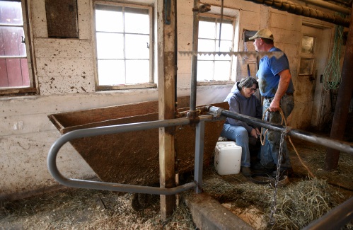
Herd departs Hartford’s last remaining dairy farm
HARTFORD — On a gray, drizzly Wednesday morning, George Miller, his son, cousin and brother pushed, pulled and cajoled 27 reluctant Jersey cows and six heifers out of the barn and onto livestock trailers that would take the animals to their new owner...
Most Read
 Hartland voters successfully petition for school budget revote
 JAG Productions announces closure, citing ‘crisis facing the arts’
 Hanover’s Perreard may soon capture the attention of collegiate coaches in two athletic pursuits
Editors Picks
 Some families find freedom with Newport microschool
 A Life: For Kevin Jones ‘everything was geared toward helping other people succeed’
 Kenyon: Hanover stalls on police records request
 Editorial: Chris Sununu’s moral vacuum

Sports

Woodstock boys lax defense steps up, holds off Hartford
WHITE RIVER JUNCTION — Monday night’s boys lacrosse game between host Hartford High and Woodstock came down to the final minute, with the Wasps prevailing, 11-10.The Vermont inter-division clash might have been decided, however, by a pair of goals at...
 Pick a sport and Pete DePalo’s has probably officiated it over the past 40-plus years
 Lebanon girls lacrosse prevails over Coe-Brown
 Local roundup: Lebanon softball sweeps wins from Souhegan, Stark
 2024 Upper Valley high school tennis guide
Opinion

Editorial: Gambling tarnishes America’s sporting life
Hey, Major League Baseball, does the name Pete Rose ring a bell? Remember him, “Charlie Hustle”? One of the game’s greatest players, whom you banned for life in 1989 because he bet on baseball games?We ask because you have on your hands another...
 By the Way: A white nationalist’s many mistruths
 Column: The age-old question of what to read
 Editorial: Transparency wins in NH Supreme Court ruling
 A Yankee Notebook: Among the crowds on vacation out West

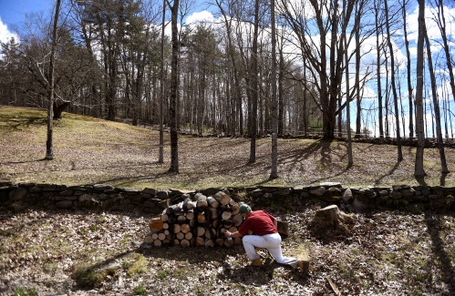
Photos
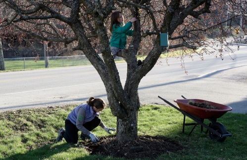
Spring cleanup in Lebanon
 Drawn to dragons
 Clear and free in Hartford
 Ramping up their foraging
 Roadside assist in Bethel
e-Edition
Arts & Life
Heat pumps and underground holes: Dartmouth announces $500 million investment in decarbonization
Dartmouth College announced this week it would invest half a billion dollars on climate mitigation efforts, including transitioning the school’s heating system off of fossil fuels.Sian Leah Beilock, Dartmouth’s president, said in a statement that the...
 JAG Productions announces closure, citing ‘crisis facing the arts’
 How a hurricane and a cardinal launched a UVM professor on a new career path
 Out & About: Vermont Center for Ecostudies continues Backyard Tick Project
 Art Notes: After losing primary venues, JAG Productions persists
Obituaries
 Donna Trottier
Wilder, VT - In Loving Memory of Donna Trottier aka Felicia D. Hinds It is with heavy hearts that we announce the passing of Donna Trottier, a beacon of fierce love, kindness, and generosity, who departed this world just a week before ... remainder of obit for Donna Trottier
 Marla Polonco
Barre, VT - It is with great sadness that the family of Marla (Neily) Polonco announces her passing January 30, 2024 at age 45. Marla was predeceased by her mother Deborah Ashton. She leaves behind her father and stepmother, Phil and L... remainder of obit for Marla Polonco
 Richard Pariseau
Newport, NH - Richard N. Pariseau, 93, of Newport, NH, passed peacefully at his home, April 16, 2024. Dick was born and spent his full, robust life in Newport. Dick married Betty Gilson and enjoyed 70 years of marriage before her pa... remainder of obit for Richard Pariseau
Adrian W. Frary Jr.
Adrian W. Frary, Jr. Tunbridge, VT - Adrian W. Frary, Jr., age 98, passed Wednesday, April 3, 2024. Calling hours will be held on Saturday, April 27, 2024 from 6 to 8pm at the Boardway and Cilley Funeral Home in Chelsea, VT. A graveside... remainder of obit for Adrian W. Frary Jr.